[ June 2026 ]
One of Dubai's most ambitious lifestyle apps, redesigned from the ground up, then expanded into a property ecosystem.
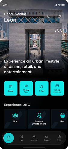
DIFC isn't just a financial district. It's a city inside a city.
The Dubai International Financial Centre is one of the most significant business and lifestyle hubs in the Middle East; home to hotels, restaurants, galleries, retail, residential spaces, and a large commercial real estate market. DIFC Plus was the app meant to tie all of it together: a single place for residents, workers, and visitors to navigate the district, access services, and manage their relationship with the space.
By the time this project came to me, the app had the bones — a 3D map, venue listings, and a handful of services like parking, valet, and car wash. But it was inconsistent, the UI wasn't holding up, and two major new product lines needed to be designed from scratch. I was brought in to redesign the entire app and build out what came next.
System first. Screens second.
Before a single screen was designed, I built the design system. DIFC already had strong brand guidelines; what it didn't have was a digital extension of them. I started by understanding the client's aesthetic sensibility and taste, then translated that into a tokenised color and component system built on their brand palette.
The system followed Atomic Design Methodology: Atoms, Molecules, Organisms, Templates, & Pages; built to support three separate pillars in the products without drifting into inconsistency. Light and dark mode were both accounted for from the start. This wasn't just good practice; it was the only way to move fast across three products without everything falling apart.
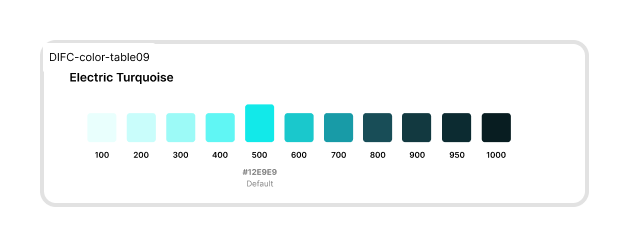
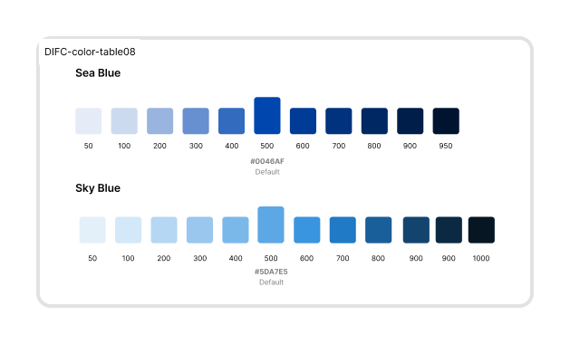
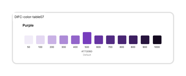
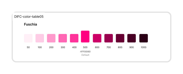
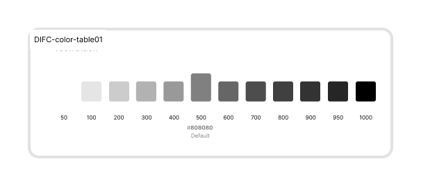
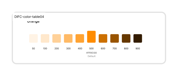
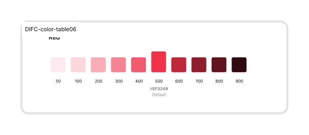
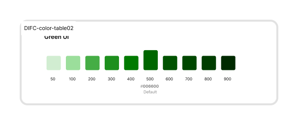
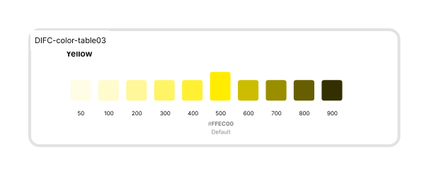
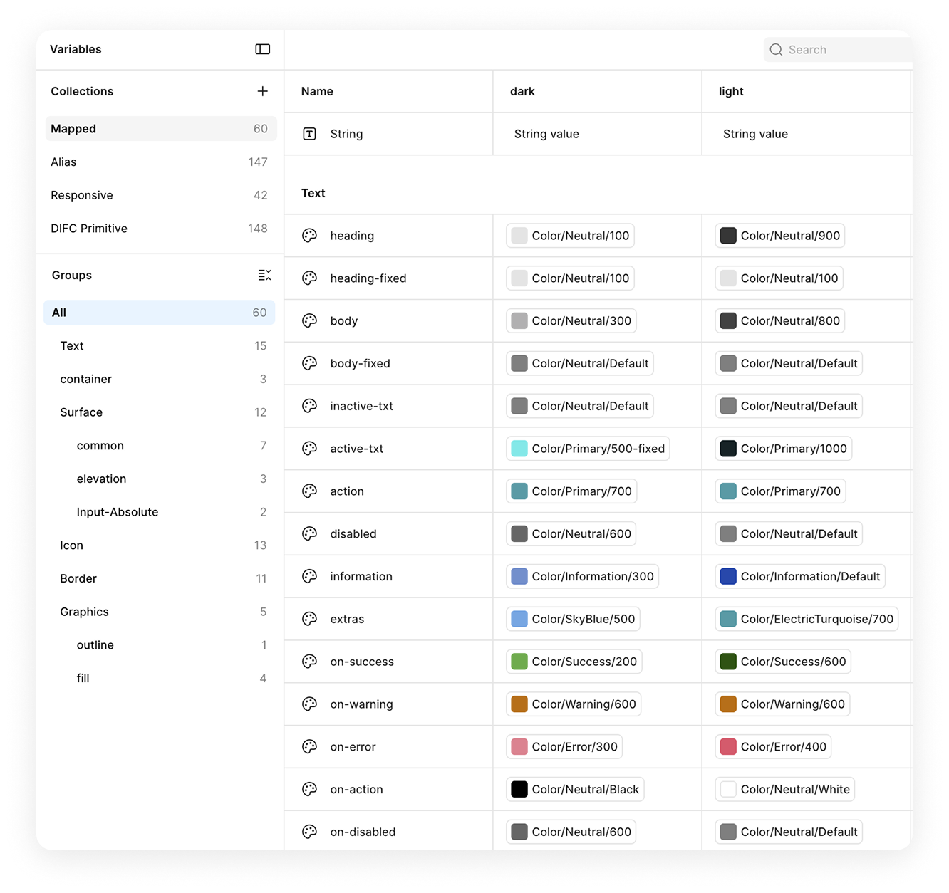
A three-tier token system
Primitive tokens hold the raw palette. Alias tokens give those values meaning (e.g. action, on-error). Mapped tokens bind alias to light and dark mode, so a single token swap re-themes the whole product.
What we ended up doing with the system
01 DIFC Plus · Core App Redesign
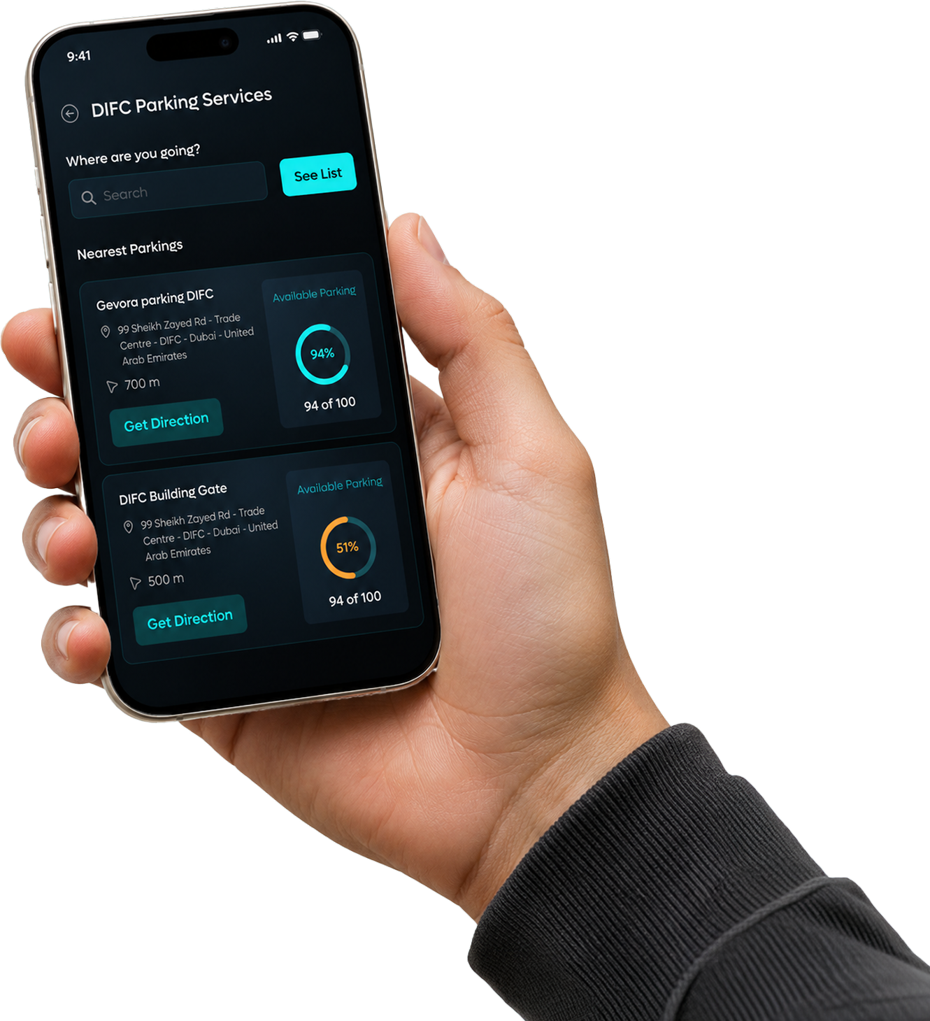
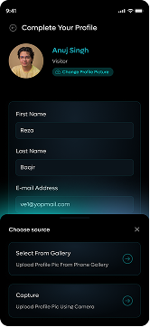
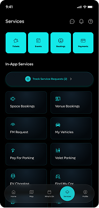
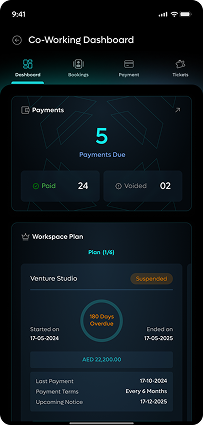
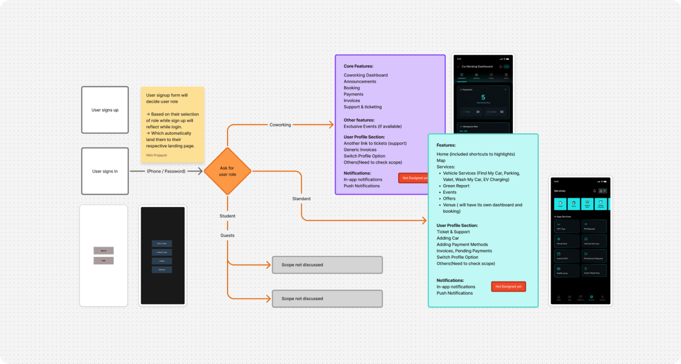
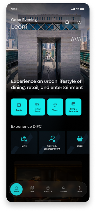
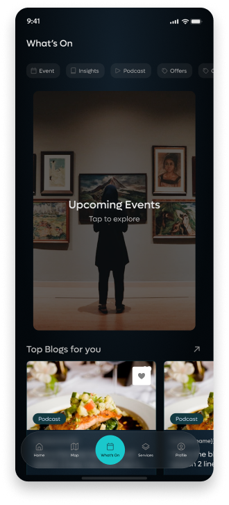
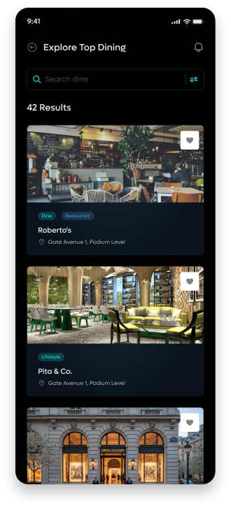
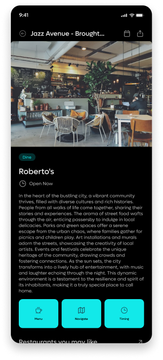
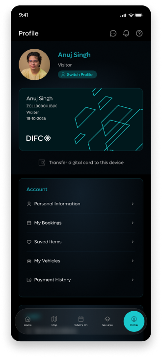
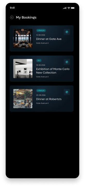
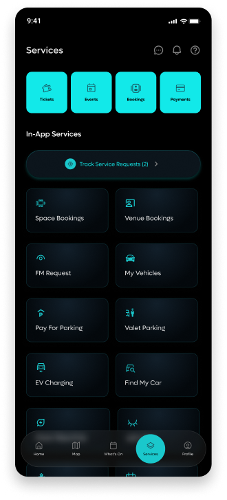
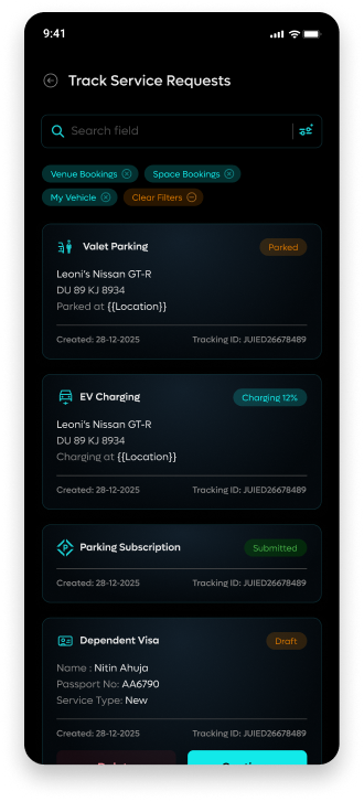
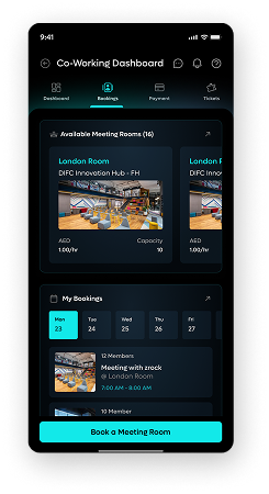
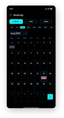
The core app is what most users interact with: finding restaurants, booking events, managing parking, accessing co-working spaces. It's the front door to DIFC. The existing version had the right idea but the execution was patchy; features felt bolted on, the visual language was inconsistent, and services didn't behave like a coherent product.
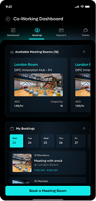
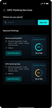
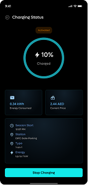
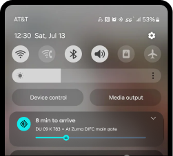
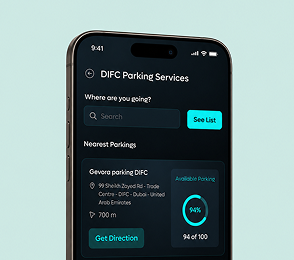
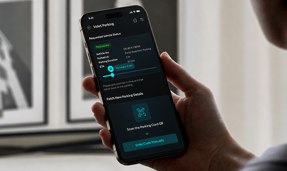
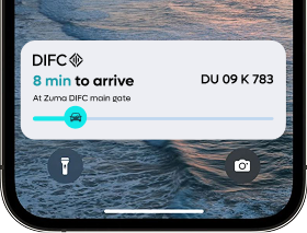
I redesigned every screen from scratch. The 3D map stayed, it was genuinely useful; but everything built around it was rethought. Services were consolidated and made consistent. Co-working space booking was introduced as a new feature. The listings experience was improved. Parking, valet, car wash, and find-my-car were cleaned up and unified under a single services architecture.
02 Tenex · Real Estate Services
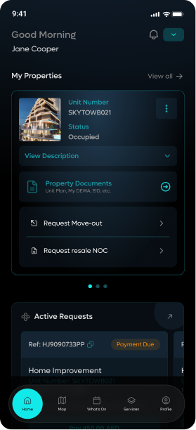
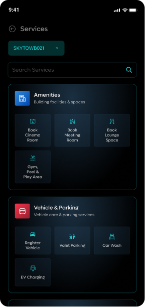
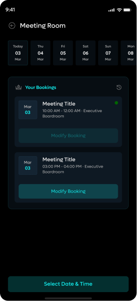
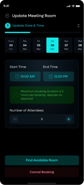
TenX is the layer of DIFC Plus built for people who live or work inside DIFC's real estate. If you own an apartment or lease an office, TenX is where you manage your relationship with the building — booking the gym, requesting maintenance, tracking housekeeping, arranging interior work.
The core interaction model was simple: find the service you need, submit a request, track it. But getting that to feel lightweight took work. I mapped every service category, designed the request and tracking flows, and made sure the UI didn't feel like filling in a government form. The goal was something you'd actually want to open.
03 Property Management
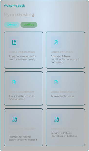
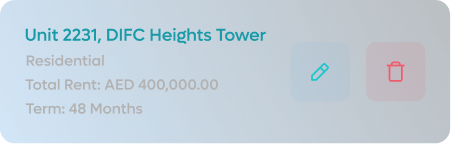
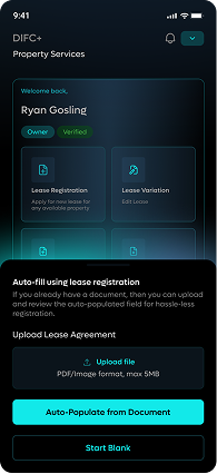
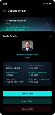
This was the most complex of the three. The property management system handled lease agreements, subletting, ownership records, tenant access, and broker workflows; all in one place. The data relationships were complicated. The forms were long. The edge cases were many.
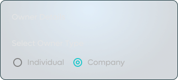
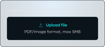
I approached it by breaking every long form into a structured multi-step flow, each step focused, each ending with a summary the user could review before moving on. Nothing was a wall of fields. The architecture of the forms followed the actual process: what does a broker need to do first? What does an owner confirm? What does a tenant sign off on? The sequence was the design.
This is also where the most client pushback landed. The client had strong opinions about how the flows should work, opinions that didn't always align with how the actual users would need to use them. The approach was to show, not argue, walkthroughs, annotated flows, and user rationale for every decision.
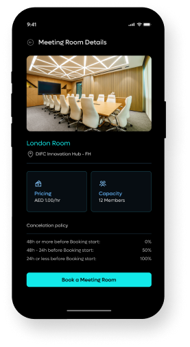
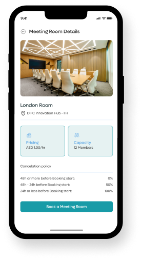
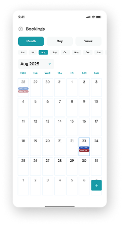
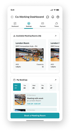
Shipped. Approved. 40+ services designed.
The client approved the work across all three pillars: DIFC Plus, Tenex, and the property management system. 40+ services were designed end to end, from the first atom in the design system to the final screen along with motion design and few animations in the most complex multi-step flow. The design held together across products, user types, and edge cases; which, given the scope, was the outcome that mattered most.